
Most display plugins can be customized using TcThemeBuilder, a utility class that allows you to simply configure fonts, colors, spacing, grids and icons. To the left you can see cool-blue theme with a multi-column grid layout.
Grids allow for multi-column menus by breaking rows up into multiple columns. You can configure graphical settings at the default level, or even override settings for a specific menu item.
Choosing a theme to get started in a new project
To avoid having to define the fonts, spacing, colors and other details from scratch, we have a few starter themes that can be applied out of the box. In code generator, whenever a graphical display plugin is selected that needs a theme, then the theme is shown underneath the display plugin choice. You can either choose one of the “starter themes” or the manual theme that applies no style whatsoever (not recommended for beginners).
IMPORTANT: Do not pick a color theme for a monochrome display, it is unlikely to work.
Once you’ve run code generator for the first time, a new header file for the theme will be added to your project. Once added, this will not be altered or overwritten, so you are safe to edit it but we still recommend that once you edited it you should rename it and move to the manual theme approach. If you want to regenerate the theme header file, simply delete the file and the designer will generate it again.
Working with Theme Builder
Theme builder is by far the easiest way to modify how rendering works and you can use theme builder in two ways. Either to completely define how drawing takes place (this is what the theme does), or just to override a few settings in your project files. The class itself is called TcThemeBuilder, to use if we first include it:
#include <graphics/TcThemeBuilder.h>
Then where we want to use it, we simply create an instance locally, it doesn’t use much memory so is safe as a local variable.
TcThemeBuilder themeBuilder(renderer); // provide your renderer as the parameter.
Now let’s discuss the core functionality of the builder.
Setting up the display dimensions and basics
Unless you’re starting from scratch, the theme will have already called dimensionsFromRenderer so if you’re using the builder to modify an existing layout you can skip doing it again. To auto set the display dimensions from the renderer, and set up how the menu title should be displayed, along with if analog values should be shown as slider controls:
themeBuilder.dimensionsFromRenderer()
            .withRenderingSettings(titleMode, useAnalogSliders)
Where:
- titleMode - one of the title mode enumeration values: BaseGraphicalRenderer::TITLE_ALWAYS, BaseGraphicalRenderer::NO_TITLE, BaseGraphicalRenderer::TITLE_FIRST_ROW
- useAnalogSliders - true/false to choose if analog values should show like a percentage bar or not.
As you can see above, we use call chaining, this is because each function returns itself, so you can call the next function. Often referred to as builder pattern. Importantly, you must remember at the end of your configuration to call themeBuilder.apply(), and if any structural changes were made, you may even need to menuMgr.resetMenu()
Configuring the basic drawing settings
Here is an example series of settings from one of our themes, let’s discuss what they do step by step:
const color_t coolBlueItemPalette[] = {RGB(255, 255, 255), RGB(0,64,135), RGB(20,133,255), RGB(31,100,178)};

themeBuilder.dimensionsFromRenderer()
        .withSelectedColors(RGB(31, 88, 100), RGB(255, 255, 255))
        .withItemPadding(MenuPadding(top, right, bottom, left))
        .withTitlePadding(MenuPadding(all))
        .withRenderingSettings(titleMode, false)
        .withPalette(coolBlueItemPalette)
        .withNativeFont(itemFont.fontData, itemFont.fontMag)
        .withSpacing(1);
Firstly the dimensions are configured automatically by calling dimensionsFromRenderer this sets the display sizes by querying the display plugin. Then the selected colors are chosen using the RGB macro for each color. As you’d probably expect by convention the RGB macro takes red, green and blue parameters between 0 and 255.
After that the item and title padding are configured, you can see we demonstrate both ways to construct a padding object (either all sides same, or separate value for each). The padding is within the rectangle of a menu item, and “pads out” the rectangle’s size. You configure the title and item spacing separately (as they are usually different).
Then we provide the title mode as described in the section above followed by the palette (we’ll discuss palettes later in more detail) but these are four colors to be used when drawing the item.
Next, we configure the default font. Fonts can be configured in many different ways, either using “native font” or you can directly provide adafruit or tcUnicode fonts using specialised overrides. See the section on fonts below, there is also another guide on fonts and how to use them. The three theme methods for dealing with fonts are:
withNativeFont(void* fontData, int fontMagnification);
withAdaFont(const GFXfont* font, int mag = 1)
withTcUnicodeFont(const UnicodeFont* font)
Lastly, the spacing is an amount of vertical space AFTER an item. It will not be part of the item’s rectangle.
Setting up the absolute minimum
In addition to the above, you need to tell the menu how to render items, action items (selectable items), and titles. To do this we tell the theme builder the default method of drawing for each, here is an example from one of our themes.
Choosing editing icons
Editing icons are hints for users that are especially important when using a rotary encoder or keyboard arrangement for selection and editing. They appear to the left of a menu item to give a visual clue that it is either selected or editing. In touch arrangements this is not as important. You can decide if you wish to include these visual clues and which icons to use.
There are two default options for these icons:
    themeBuilder.withStandardMedResCursorIcons(); // for medium resolution displays
    themeBuilder.withStandardLowResCursorIcons(); // for lower resolution displays
Or to specify them manually you provide the size of the icons as a Coord object, and then each icon as an XBMP where both must be the same size:
themeBuilder.withCursorIconsXbmp(Coord(8, 8), editIcon, activeIcon) {
Drawing in grid positions
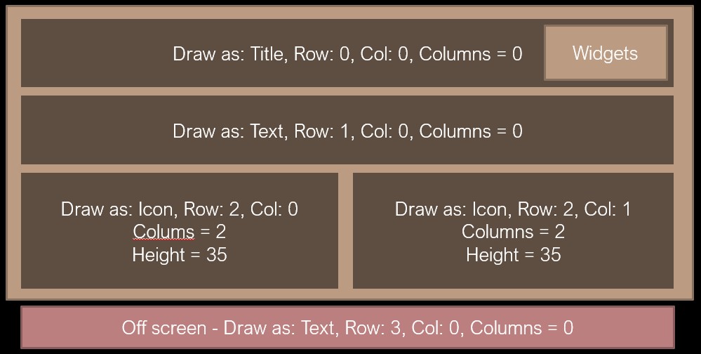
Menu items are drawn in a grid layout as presented in the image above. We can draw a menu item at any grid and row position. The layout for manually overridden items is run first, so other items flow around them.
Further, if the item at row 0 is the title, then any title widgets will also be rendered onto the right. If you choose to use active and edit icons, then appear on the left and are not considered part of the item.
There are three ways to draw:
- Fully on the fly, don’t configure any grid positions, every item will be on a new row by default in menu order.
- Partial overriding of the grid positions where some items layout manually, other automatically.
- Full overriding of grid positions for every menu item in a given submenu.
Changing the drawing parameters
You can also change the font, color, padding, size and default justification at three levels (shown below in priority order):
- Item level, where there is a match on menu item
- SubMenu level, when there is no match at item level
- Default settings when no others match
- Last chance item that’s compiled in just in-case there is a severe mis-configuration to avoid returning
nullptr.
To change the default settings use themeBuilder.defaultActionProperties(), themeBuilder.defaultItemProperties() or themeBuilder.defaultTitleProperties() on a theme builder. This will take effect when there are no other overrides
To change the settings for all items that belong to a submenu use themeBuilder.submenuPropertiesActionOverride(subMenuItem), themeBuilder.submenuPropertiesActionOverride(subMenuItem) on theme builder, providing the menu to apply these settings to. This will take effect when there are no item level overrides.
To change the properties for a single item use themeBuilder.menuItemOverride(menuItem) on theme builder, providing the menu item. This item will always have priority over anything else. Important note that if you apply changes at the item level, it is normally best to manually set the row(..) to keep control of the ordering.
These all use chained builder syntax as described elsewhere in this guide. You adjust the settings as desired, and finally you must call the apply() method. See below for examples.
Creating two icon menu items on the same row
Here we present an example theme builder layout to show how to override two menu items so that they appear on the same row, row 3 in this case, one with an XBMP image, the other with a color 4 bit per pixel palette image. Note that TcMenu Designer can generate XBMP and palette images
// for menuEngine, we override the drawing to use a color palette based icon
themeBuilder.menuItemOverride(menuEngine)
        .onRowCol(3, 1, 2) // on the third row, at column 1, with two columns
        .withImage4bpp(Coord(64, 64), engineBitmap_palette0,  engineBitmap0)
        .apply();

// for menuStatus, we override the drawing to use an XBMP monochrome icon
themeBuilder.menuItemOverride(menuStatus)
        .onRowCol(3, 2, 2) // on the third row, at column 2, with two columns
        .withImageXbmp(Coord(64, 64), statusIconBits)
        .apply();
In the above, the row and column upon which the item should appear in configured with onRowCol(row, col, columnsOnRow) and then the renderer is told to draw as an icon. Lastly, and very importantly we call apply().
Overriding a single item’s palette, border or font
Let’s say we want an item to have a different palette, border, and justify differently:
    themeBuilder.menuItemOverride(menuSpecial)
        .withJustification(GridPosition::JUSTIFY_LEFT_NO_VALUE)
        .withBorder(MenuBorder(1))
        .withPalette(specialPalette)
        .withAdaFont(myAdafruitFontPtr)
        .onRow(1) // on the first row
        .apply();
Advanced - Overriding submenu drawing
Let’s say we want an entire submenu to render with a different palette and adafruit font by default for regular items:
    themeBuilder.submenuPropertiesItemOverride(menuSpecial)
        .withAdaFont(myAdaFont, magnification)
        .withPalette(specialPalette)
        .apply();
To do the same for action items themeBuilder.submenuPropertiesActionOverride().
- see TcThemeBuilder docs
- see GridPosition docs
- see the
addGridPositionmethod in ItemDisplayPropertiesFactory
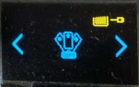
Using card layout
Card layout works differently to regular layout in that there is only ever one item on the display, and it takes up all the available space. This layout is often used when there are a few options at the top level, and you want to use icons or large fonts to present them.
Let’s take an example of a turntable that had only four top level options, 33rpm, 45rpm, 78rpm and lastly, Settings. We may choose to use a card layout using a large letter font for the speeds (33, 45, 78) and a cog icon for the settings. Just as we learnt above how to change the way that items render, we do exactly the same for card layout (I.E. we create a menuItemOverride or submenuPropertiesItemOverride for each item we want to lay out as a card).
Below we see an example display where card layout has been enabled for the menu, the main area in the middle belongs entirely to the menu item, excepting the areas taken by any widgets or title at the top, and the left and right icons that show when you can move left or right. When there is an item to the “left” then the left icon is shown, and when there is an icon to the “right”, the right icon is shown.
Enabling card layout
To enable card layout, it is easiest to do so from theme builder (see above):
themeBuilder.enableCardLayoutWithXbmImages(Coord(wid, hei), TheLeftXBmpData, TheRightXbmpData, monoDisplay);
This enables card layout for the root menu and provides the “left” and “right” icons that are shown on the sides of the display. The two Xbmp icons must be the same size. From the above example image, the left and right Xbmp parameters are the arrows you see at the sides. Finally, the last parameter indicates if the display is monochrome, and slightly changes the greying out behaviour. We can also control card layout a sub-menu at a time:
themeBuilder.setMenuAsCard(menuStatusCards, true);
This would enable menuStatusCards to use card layout. If the second parameter were false, it would return the menu to regular layout.
As with any other adjustments to the renderer, ensure you call apply afterwards.
themeBuilder.apply();
The Stm32DuinoDemo and esp32s3TftEncoder examples both use card layout extensively. It is best practice whenever possible to enable card layout at startup, as it is done in the two examples.
Common structures and classes
Along with this overview, please see the reference documentation for more complete details, they will not be repeated here:
struct Coord - coordinates
Stores an X and Y coordinate in a 32bit bit-packed struct. It supports copy construction and assignment. You can directly access x and y.
Coord myCoord(10, 4);     // create a coord with x=10 and y=4
Coord copyCoord(myCoord); // copy myCoord into copyCoord
int x = myCoord.x;
int y = myCoord.y;
struct MenuPadding - item padding
Works similar to padding in HTML, You can directly access the top, bottom, left, right values.
MenuPadding equalPadding(4);                        // all sides have padding of 4
MenuPadding perSidePadding(top, right, bottom, left); // per side padding.
Color palettes and how they relate to menu items
Color palettes can be provided at the default level, the submenu level, or for a given item. They are defined as part of the properties. Each property current takes a four color palette, each color in the palette has a special meaning as follows:
Palette 0 - TEXT
Used to draw the textual components for COMPTYPE_ITEM, COMPTYPE_TITLE and COMPTYPE_ACTION types
Palette 1 - BACKGROUND
used to draw the background for any item, but for COMPTYPE_ITEM it is also the entire background color.
Palette 2 - HIGHLIGHT1
Highlight 1 is used for various additional drawing components, and varies by the type of item being drawn.
- For the title this refers to the widget color.
- For Up/Down items, this refers to the color of the button backgrounds.
- For slider controls it is the active part of the slider area.
Palette 3 - HIGHLIGHT2
- For sliders this is the inactive part of the slider area.
- For icon actionable items, this is the colour of the icon when it is not active.
Selected color
You can also set the selected text and background color, these will override other choices when the item is selected, so they should be as compatible as possible with the rest of the color scheme.
Font overview
Read the guide for setting up fonts in the menu designer.
Some take away notes
- Many of the examples create grid layout overrides, you can take a look how they do it.
- Apart from SSD1306Ascii and LCD Uno, all other renderers draw in grids.
- For an override to work, the item must appear in the menu structure before the row would be rendered normally. Otherwise it would have been placed automatically.
- An override contains the position, the columns, drawing mode, and optional height.
- When a new submenu is shown, the renderer sets up a drawingCache as shown in the pseudocode below:
FOR each item in the current menu
    LET gridPosition = gridOverrides.getForItem(item)
    IF gridPosition was found
        Put item in drawingCache at the position specified by gridPosition
    ELSE
        Put item in drawingCache at next available grid row, colums=1, height=0
    END IF
END FOR
ItemPropertiesFactory and graphical displays (advanced)
Our flexible configuration based rendering is made possible by a display factory. The display factory stores all the grids, icons and drawing properties in high performance btree lists that are optimised for reading. Graphical displays nearly always have a ConfigurableItemDisplayPropertiesFactory that can be obtained using renderer.getGraphicsPropertiesFactory(). The themes are always a good starting point for making adjustments to these values.
The properties cache in more detail (advanced)
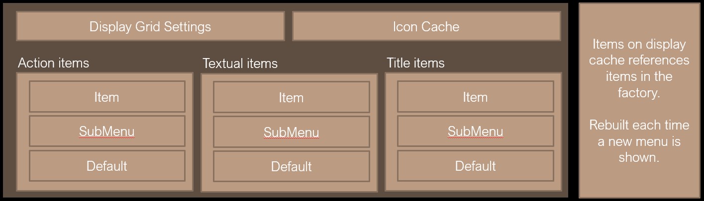
There is a properties cache within any graphical menu application, the cache stores the grid positions, icon cache and also a list of drawing properties as described above. These are stored in high performance btree lists, and memory usage is quite minimal for most applications.
Each time a new menu is displayed, the rows are calculated upfront to avoid having to query these lists and perform the priority defaulting during each run.